
Wix Bookings Mobile Calendar Rewrite
Wix Bookings Mobile Calendar Rewrite
Wix Bookings Mobile Calendar Rewrite
Turning a heavily used legacy feature into a clearer, faster, and more scalable system serving multiple Wix products. The project involved several teams and took several months to complete. This case study covers some of the key aspects of that effort.
Turning a heavily used legacy feature into a clearer, faster, and more scalable system serving multiple Wix products. The project involved several teams and took several months to complete. This case study covers some of the key aspects of that effort.


Project introduction
Project introduction
Years of accumulated ad-hoc functionality had made the Calendar harder to use, slower under heavy data loads, and increasingly difficult to extend. Since multiple Wix products relied on it, every change had to account for requirements beyond any single product. So the task wasn't to redesign a calendar screen - it was to rebuild it as a system that could support different products, views, and future requirements without carrying the legacy complexity forward.
Years of accumulated ad-hoc functionality had made the Calendar harder to use, slower under heavy data loads, and increasingly difficult to extend. Since multiple Wix products relied on it, every change had to account for requirements beyond any single product. So the task wasn’t to redesign a calendar screen - it was to rebuild it as a system that could support different products, views, and future requirements without carrying the legacy complexity forward.
4M business owners, relying on 5 products
4M business owners, relying on 5 products
4M business owners, relying on 5 products
using ONE calendar
using ONE calendar
using ONE calendar
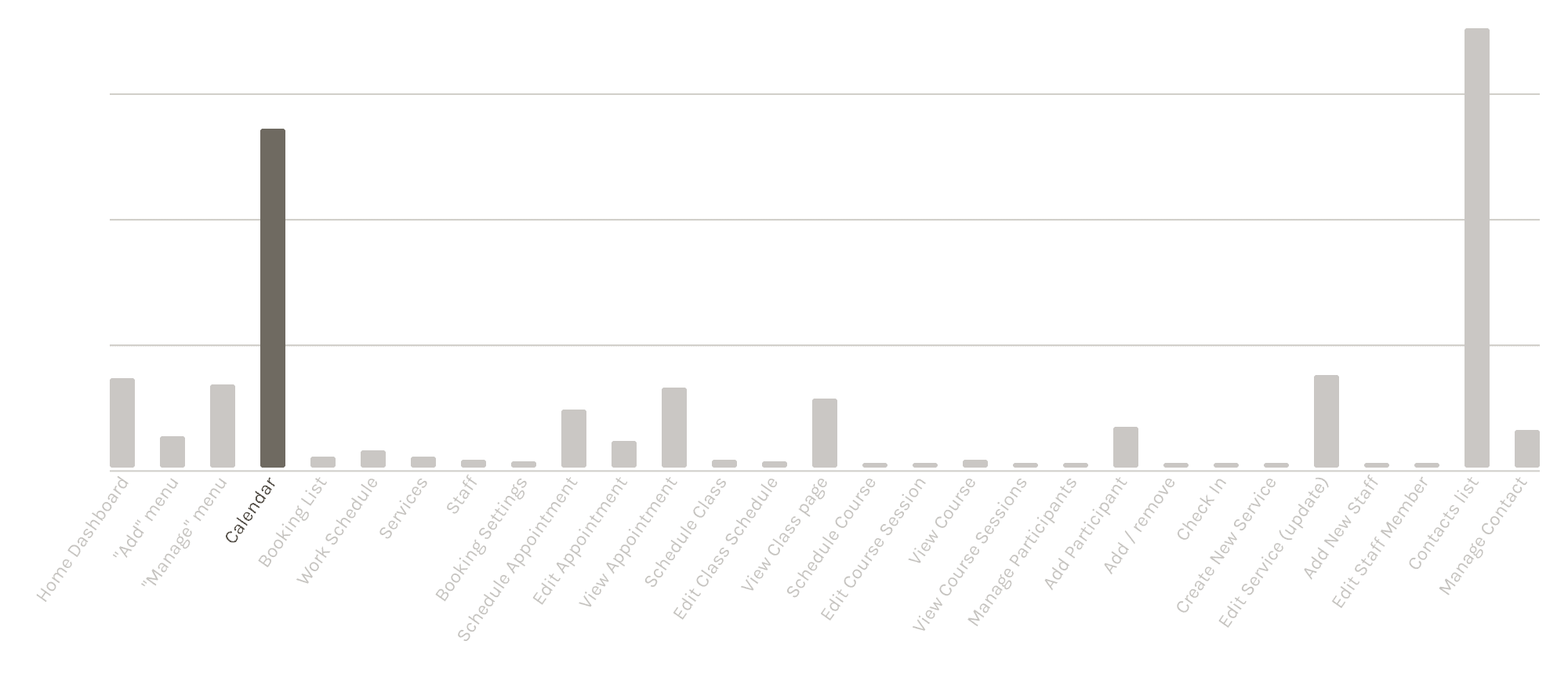
The Calendar is one of the most used features in Wix Bookings and a cross-product solution in its own right, serving several Wix products that contribute significantly to Wix's Gross Payment Volume. In interaction volume across Wix Bookings, the Calendar is second only to the Contacts list.
The Calendar is one of the most used features in Wix Bookings and a cross-product solution in its own right, serving several Wix products that contribute significantly to Wix’s Gross Payment Volume. In interaction volume across Wix Bookings, the Calendar is second only to the Contacts list.
The Calendar was a set of screens and behaviours - a composite rather than a single screen. Its main views were:
Agenda - a chronological list of a day’s events, sessions and classes.
Timeline - a time/date grid with events represented as cards with supported week and single-day variants.
Expanded calendar - a handle expanded the week grid into a full month view.
The Calendar was a set of screens and behaviours - a composite rather than a single screen. Its main views were:
Agenda - a chronological list of a day’s events, sessions and classes.
Timeline - a time/date grid with events represented as cards with supported week and single-day variants.
Expanded calendar - a handle expanded the week grid into a full month view.
Legacy calendar Agenda view
Legacy calendar Agenda view

Legacy calendar Timeline view
Legacy calendar Timeline view

Legacy calendar Timeline expanded month
Legacy calendar Timeline expanded month

As a UX designer on Wix's Mobile Design System team, I partnered closely with our engineers and with the Wix Bookings product and engineering teams for a complete rewrite of the legacy calendar. My scope covered the general calendar UX, introducing new capabilities, component architecture, interaction patterns, and state logic.
As a UX designer on Wix’s Mobile Design System team, I partnered closely with our engineers and with the Wix Bookings product and engineering teams for a complete rewrite of the legacy calendar. My scope covered the general calendar UX, introducing new capabilities, component architecture, interaction patterns, and state logic.
What I needed to solve
What I needed to solve
Several issues came up repeatedly in user interviews and in conversations with product teams:
Missing functionality - many users also worked with products such as Google Calendar and expected familiar behaviour. The Calendar also had a desktop presence, and its features had to carry over to mobile coherently.
Modularity and scalability - more specialised Wix products, such as Restaurants or Events, needed calendar functionality tailored to their workflows and future product needs.
Experience quality - many issues surfaced in neither user interviews nor product conversations, but improving the overall UX was inseparable from the main effort.
Several issues came up repeatedly in user interviews and in conversations with product teams:
Missing functionality - many users also worked with products such as Google Calendar and expected familiar behaviour. The Calendar also had a desktop presence, and its features had to carry over to mobile coherently.
Modularity and scalability - more specialised Wix products, such as Restaurants or Events, needed calendar functionality tailored to their workflows and future product needs.
Experience quality - many issues surfaced in neither user interviews nor product conversations, but improving the overall UX was inseparable from the main effort.
Deciding what was worth building
Deciding what was worth building
I studied mature calendar products, with Google Calendar as an important reference because of its established interaction model and familiarity to many of our users. I wasn't looking for visual inspiration - the focus was on behaviour: navigation, interaction patterns, screen logic, and how other products handled complex scheduling. In parallel, I mapped the existing Wix Calendar to see what users relied on and where the system needed more flexibility.
Together with the Bookings team, we prioritised the features into Must Have, Important, and Nice to Have. The goal was to decide which functionality genuinely justified the UX and technical complexity it introduced.
I studied mature calendar products, with Google Calendar as an important reference because of its established interaction model and familiarity to many of our users. I wasn’t looking for visual inspiration - the focus was on behaviour: navigation, interaction patterns, screen logic, and how other products handled complex scheduling. In parallel, I mapped the existing Wix Calendar to see what users relied on and where the system needed more flexibility.
Together with the Bookings team, we prioritised the features into Must Have, Important, and Nice to Have. The goal was to decide which functionality genuinely justified the UX and technical complexity it introduced.
MUST HAVE
MUST HAVE
MUST HAVE
Better performance
Configurable event cards
3 days view
"Back to today"
“Back to today”
IMPORTANT
IMPORTANT
IMPORTANT
Tap to add a new event
Current time indication
Full screen calendar
Search functionality
NICE TO HAVE
NICE TO HAVE
NICE TO HAVE
Calendar zoom in/out
Scroll to newly created event
Drag to reschedule an event
Establishing the structure
Establishing the structure
Different views solve different problems, but should still feel like parts of the same product. The architecture had to work across products, modes, and future use cases - almost like a design system of its own. With the feature set defined, I structured all Calendar screens around three shared blocks.
1. Calendar Header - is a configurable tool panel containing actions such as Search, Filter, or actions Menu.
2. Calendar Grid - is the actual dates grid displayed as a number of days or a month. It handles date selection, states, indicators, and the visible date range.
3. Calendar View - presents the sessions and events timeline or an agenda, according to the user's selected view.
The app-level header and navigation remained outside the Calendar and reused existing components from our mobile design system.
Different views solve different problems, but should still feel like parts of the same product. The architecture had to work across products, modes, and future use cases - almost like a design system of its own. With the feature set defined, I structured all Calendar screens around three shared blocks.
1. Calendar Header - is a configurable tool panel containing actions such as Search, Filter, or actions Menu.
2. Calendar Grid - is the actual dates grid displayed as a number of days or a month. It handles date selection, states, indicators, and the visible date range.
3. Calendar View - presents the sessions and events timeline or an agenda, according to the user’s selected view.
The app-level header and navigation remained outside the Calendar and reused existing components from our mobile design system.

Each block was designed and built independently, while the logic layer governed how they worked together in a specific product context or calendar view. This approach provided the scalability the Calendar had been missing.
Each block was designed and built independently, while the logic layer governed how they worked together in a specific product context or calendar view. This approach provided the scalability the Calendar had been missing.
Calendar header
Calendar header

Calendar grid
Calendar grid

Calendar view
Calendar view

Simplifying the interaction model
Simplifying the interaction model
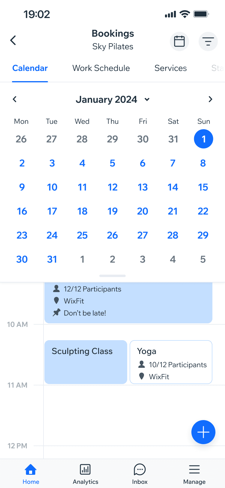
The legacy Calendar relied heavily on gestures. Dragging expanded a week into a month as a "drawer", while swiping navigated between months once expanded. Individually these interactions felt sophisticated. Together they created unnecessary behavioural and structural complexity, and they were one of the elements affecting performance.
The legacy Calendar relied heavily on gestures. Dragging expanded a week into a month as a “drawer”, while swiping navigated between months once expanded. Individually these interactions felt sophisticated. Together they created unnecessary behavioural and structural complexity, and they were one of the elements affecting performance.
Using handle to drag calendar down
Using handle to drag calendar down

Expanded calendar
Expanded calendar
Swiping across the calendar grid to navigate
Swiping across the calendar grid to navigate

I observed how users actually interacted with the legacy Calendar. Most switched from week to month view by tapping the month name, while swiping between months was already a familiar behaviour. I removed the drag-to-expand interaction and kept swipe navigation. This simplified the model, improved responsiveness, and gave us a better foundation for the Full Calendar mode we wanted to introduce.
I observed how users actually interacted with the legacy Calendar. Most switched from week to month view by tapping the month name, while swiping between months was already a familiar behaviour. I removed the drag-to-expand interaction and kept swipe navigation. This simplified the model, improved responsiveness, and gave us a better foundation for the Full Calendar mode we wanted to introduce.
Using picker to expand the calendar
Using picker to expand the calendar

Expanded calendar
Expanded calendar

Swiping across the calendar grid to navigate
Swiping across the calendar grid to navigate

Rethinking the Agenda view
Rethinking the Agenda view
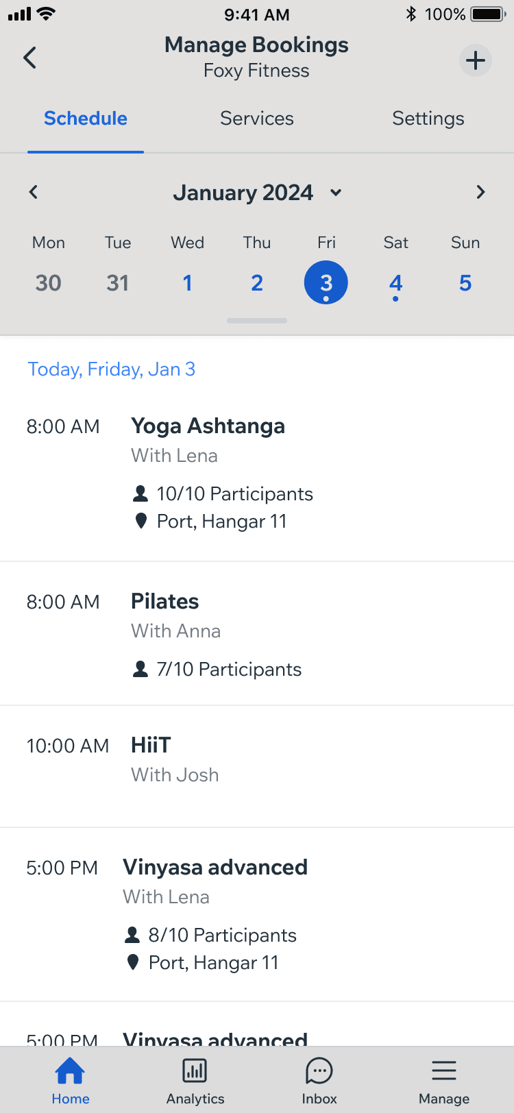
The Agenda view is a chronological list of a day's events, sessions and classes. The legacy version carried several UX issues I wanted to address:
Hours duplication - events occurring at the same time repeated the displayed hour.
Broken visual rhythm - containers adjusted to show only the fields business owners had filled in, so in some cases, containers shown were of different height.
Weak hierarchy - the layout didn't make the day in view clear, and the list lacked structure.
Inconsistency across views - the same event looked different in Agenda than in Timeline, forcing users to reinterpret identical information depending on where they saw it.
The Agenda view is a chronological list of a day’s events, sessions and classes. The legacy version carried several UX issues I wanted to address:
Hours duplication - events occurring at the same time repeated the displayed hour.
Broken visual rhythm - containers adjusted to show only the fields business owners had filled in, so in some cases, containers shown were of different height.
Weak hierarchy - the layout didn’t make the day in view clear, and the list lacked structure.
Inconsistency across views - the same event looked different in Agenda than in Timeline, forcing users to reinterpret identical information depending on where they saw it.
Legacy Agenda view example
Legacy Agenda view example
Legacy Timeline view example
Legacy Timeline view example

Event Cards
Event Cards
The central element of the Agenda was the event container, the Event Card and it played a key role in improving the experience and scalability of the calendar as a system. Agenda and Timeline show the same underlying events in very different contexts, so the Event Card needed to stay recognisable across views without forcing an identical visual treatment everywhere. I had already defined the Event Card in Timeline, so I used that as the foundation and adapted it for Agenda.
The central element of the Agenda was the event container, the Event Card and it played a key role in improving the experience and scalability of the calendar as a system. Agenda and Timeline show the same underlying events in very different contexts, so the Event Card needed to stay recognisable across views without forcing an identical visual treatment everywhere. I had already defined the Event Card in Timeline, so I used that as the foundation and adapted it for Agenda.
Event Card in Timeline view
Event Card in Timeline view

Event Card in Agenda view
Event Card in Agenda view

General structure and data stayed consistent while the layout responded to the selected view. The component also remained configurable for product teams, with elements such as icons and text kept optional rather than hard-coded. To preserve visual rhythm in the Agenda, I gave the Event Card a fixed height.
General structure and data stayed consistent while the layout responded to the selected view. The component also remained configurable for product teams, with elements such as icons and text kept optional rather than hard-coded. To preserve visual rhythm in the Agenda, I gave the Event Card a fixed height.
Layout
Layout
Displaying events as cards freed up the left side of the view. Instead of repeating each event's time - now shown inside the card - I used that space to keep the day in view present at all times. The date became an independent element that stayed sticky while scrolling, and was replaced by the next day once the last event of the previous one passed a threshold line. Since the Agenda is primarily about scrolling through events within the context of a single date, making the date prominent alongside the list mattered more than the time labels.
Displaying events as cards freed up the left side of the view. Instead of repeating each event’s time - now shown inside the card - I used that space to keep the day in view present at all times. The date became an independent element that stayed sticky while scrolling, and was replaced by the next day once the last event of the previous one passed a threshold line. Since the Agenda is primarily about scrolling through events within the context of a single date, making the date prominent alongside the list mattered more than the time labels.
Release version of the Agenda view
Release version of the Agenda view

Scrolling through the events list
Scrolling through the events list

Color coding
Color coding
The initial product direction was to colour the entire Event Card according to its assigned Timeline colour. That worked naturally in Timeline, where colour helps distinguish events positioned across a time grid. The Agenda, however, is a dense scrolling list: fully coloured cards created unnecessary visual noise and competed with optional card elements such as status labels. I proposed a uniform white card with a single coloured strip along the edge, tying it back to the event's Timeline colour. The goal wasn't to make every view look identical - it was to preserve the right relationships while adapting the interface to its context.
The initial product direction was to colour the entire Event Card according to its assigned Timeline colour. That worked naturally in Timeline, where colour helps distinguish events positioned across a time grid. The Agenda, however, is a dense scrolling list: fully coloured cards created unnecessary visual noise and competed with optional card elements such as status labels. I proposed a uniform white card with a single coloured strip along the edge, tying it back to the event’s Timeline colour. The goal wasn’t to make every view look identical - it was to preserve the right relationships while adapting the interface to its context.
Initial color coding direction in Agenda View
Initial color coding direction in Agenda View

Release version of the Agenda view
Release version of the Agenda view

Staff view
Staff view
Some products needed more specialised functionality. In businesses where staff members were one of the primary ways of scanning the schedule (e.g. Restaurants, Hotels), simply displaying the staff name inside an event card wasn't enough.
Rather than creating a new Calendar model, I reused the three-day Timeline structure I had introduced earlier in the project. Staff members became columns, with their events displayed underneath. This solved a distinct product need while keeping the new mode tied to the same interaction and rendering model - which is what made it realistic to build and maintain.
Some products needed more specialised functionality. In businesses where staff members were one of the primary ways of scanning the schedule (e.g. Restaurants, Hotels), simply displaying the staff name inside an event card wasn’t enough.
Rather than creating a new Calendar model, I reused the three-day Timeline structure I had introduced earlier in the project. Staff members became columns, with their events displayed underneath. This solved a distinct product need while keeping the new mode tied to the same interaction and rendering model - which is what made it realistic to build and maintain.
Rewrite Timeline in 3 days view
Rewrite Timeline in 3 days view

Rewrite Timeline in Staff view
Rewrite Timeline in Staff view

Refinement
Refinement
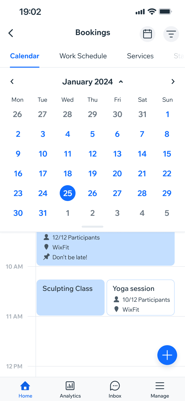
Most UI changes came directly out of restructuring the UX rather than from an attempt to visually redesign the Calendar. Some of these smaller but important tweaks and decisions:
Cleaner dates - calendar grid dates moved from bold to a lighter weight, working better with our 1.5px line icons.
Reduced use of primary (blue) colour - applying it across most of calendar dates created unnecessary visual emphasis.
Simplified month grids - Dates from previous and next months were no longer displayed by default, where they added little value and caused visual clutter.
Clearer hierarchy - subtle surfaces elevation helped distinguish the Calendar Header from the Calendar Grid providing more structured feel.
Most UI changes came directly out of restructuring the UX rather than from an attempt to visually redesign the Calendar. Some of these smaller but important tweaks and decisions:
Cleaner dates - calendar grid dates moved from bold to a lighter weight, working better with our 1.5px line icons.
Reduced use of primary (blue) colour - applying it across most of calendar dates created unnecessary visual emphasis.
Simplified month grids - Dates from previous and next months were no longer displayed by default, where they added little value and caused visual clutter.
Clearer hierarchy - subtle surfaces elevation helped distinguish the Calendar Header from the Calendar Grid providing more structured feel.
Legacy Agenda view
Legacy Agenda view
Rewrite Agenda view
Rewrite Agenda view

Pre-Rollout
Pre-Rollout
Ahead of release, alongside regular design QA, two capabilities of the new Calendar needed testing:
Dark Mode - I tested every Calendar element in Dark Mode ahead of release and resolved the visual issues this exposed.
Ahead of release, alongside regular design QA, two capabilities of the new Calendar needed testing:
Dark Mode - I tested every Calendar element in Dark Mode ahead of release and resolved the visual issues this exposed.
Agenda view in Light Mode

Agenda view in Dark Mode
Agenda view in Dark Mode

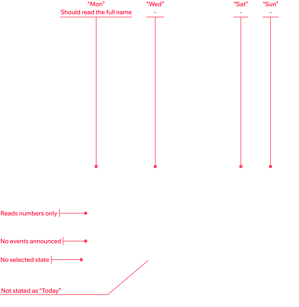
Accessibility - I audited the Calendar for accessibility issues, both visual and screen-reader related, and worked through the fixes with engineering and the Wix Accessibility team.
Accessibility - I audited the Calendar for accessibility issues, both visual and screen-reader related, and worked through the fixes with engineering and the Wix Accessibility team.



Staged rollout and iteration
Staged rollout and iteration
The new Calendar initially released to 50% of Wix Bookings users. This let us observe the rebuilt experience under real workloads and see how existing users responded to significant changes in a tool they used regularly.
User feedback on the new Calendar was positive overall, with some expected pushback. I reviewed it together with the Bookings team and addressed issues where the feedback revealed genuine usability problems and where changes made sense from both a product and implementation perspective.
The introduction of AI-assisted development during the project also allowed me to resolve some smaller issues myself, such as font sizes and colours, leaving the developers more time to focus on more complex work.
The new Calendar initially released to 50% of Wix Bookings users. This let us observe the rebuilt experience under real workloads and see how existing users responded to significant changes in a tool they used regularly.
User feedback on the new Calendar was positive overall, with some expected pushback. I reviewed it together with the Bookings team and addressed issues where the feedback revealed genuine usability problems and where changes made sense from both a product and implementation perspective.
The introduction of AI-assisted development during the project also allowed me to resolve some smaller issues myself, such as font sizes and colours, leaving the developers more time to focus on more complex work.
Outcome
Outcome
After a staged rollout, iteration and fixes, the new Calendar was released to all Wix Bookings users.
After a staged rollout, iteration and fixes, the new Calendar was released to all Wix Bookings users.
Rollout 50%
Rollout 50%
Rollout 50%
100% of Wix Bookings users
100% of Wix Bookings users
100% of Wix Bookings users
The rebuild moved the Calendar away from a collection of accumulated behaviours toward a more coherent system. Shared architecture gave different Calendar modes the same structural foundation. Configurable components let Wix products shape the experience without rebuilding the core UX. Performance improved through a combination of engineering work, restructuring, and UX decisions that removed unnecessary complexity. The result wasn't simply a redesigned Calendar, but a more scalable foundation for Calendar experiences across Wix mobile products.
The rebuild moved the Calendar away from a collection of accumulated behaviours toward a more coherent system. Shared architecture gave different Calendar modes the same structural foundation. Configurable components let Wix products shape the experience without rebuilding the core UX. Performance improved through a combination of engineering work, restructuring, and UX decisions that removed unnecessary complexity. The result wasn’t simply a redesigned Calendar, but a more scalable foundation for Calendar experiences across Wix mobile products.
Release Agenda view
Release Agenda view
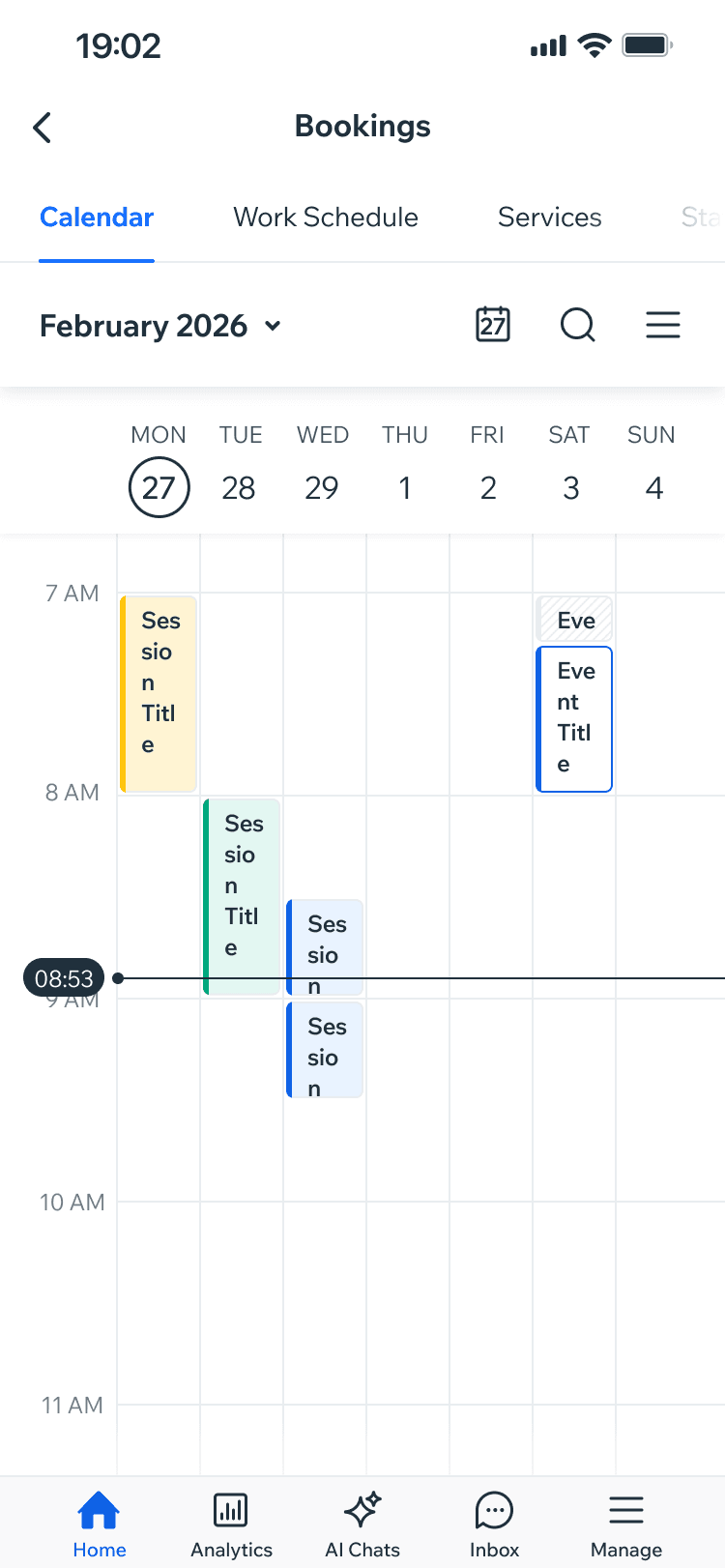
Release Timeline view (week)
Release Timeline view (week)
Release Full Calendar view
Release Full Calendar view

Reflection
Reflection
Complex product design can't be separated from the way the product is actually built. The Calendar behaved more like a small product platform than a single feature - designing it meant moving between user facing UX, system architecture, component logic, engineering constraints, and real-world product behaviour.
Working closely with engineering changed how I approached the design. Understanding how the experience would be structured in code became almost as important as defining how it should behave on screen. That combination of product UX, systems thinking, and implementation awareness is now a core part of how I approach complex design.
Complex product design can’t be separated from the way the product is actually built. The Calendar behaved more like a small product platform than a single feature - designing it meant moving between user facing UX, system architecture, component logic, engineering constraints, and real-world product behaviour.
Working closely with engineering changed how I approached the design. Understanding how the experience would be structured in code became almost as important as defining how it should behave on screen. That combination of product UX, systems thinking, and implementation awareness is now a core part of how I approach complex design.